
Overview & Problem
Problem Statement: Students faced low usability and poor transparency when addressing work orders—fragmented submission paths, unclear status/ownership, and weak mobile support.
The existing Work Orders site made it hard to know where to file a request, what information was needed, and what happens next. Limited mobile usability also slowed urgent reporting (e.g., heating issues).
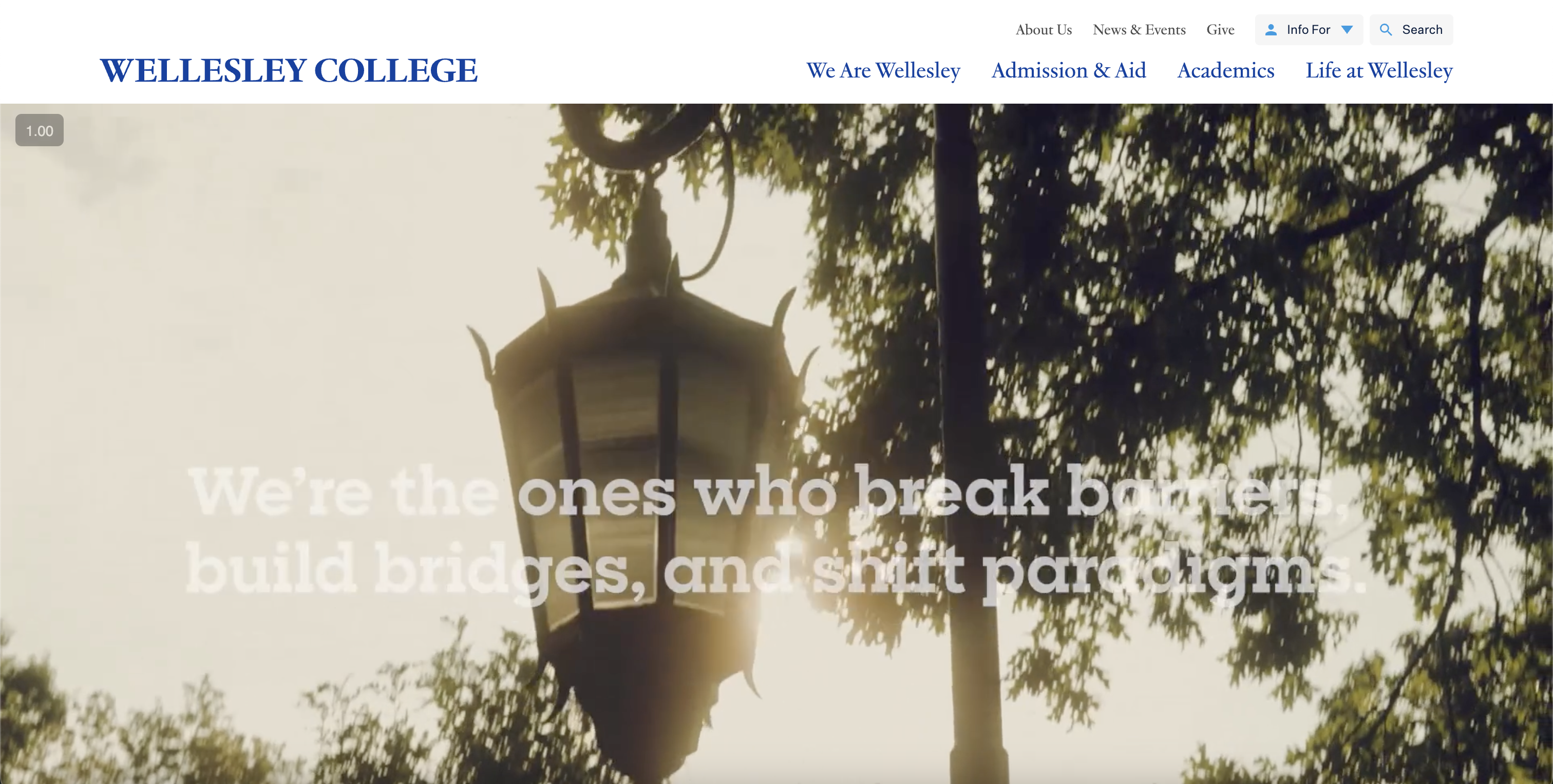
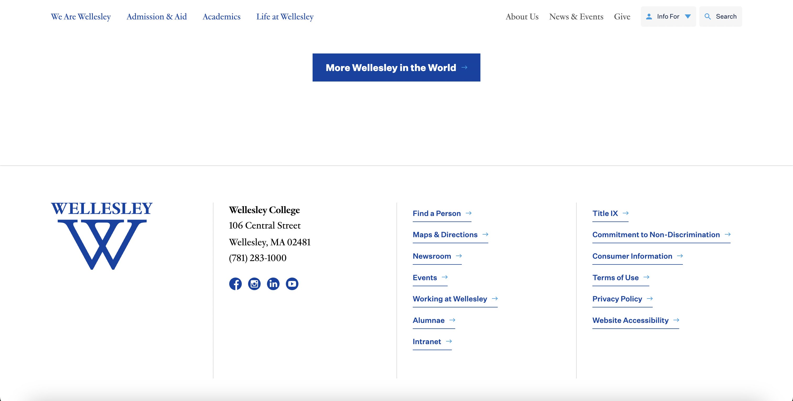
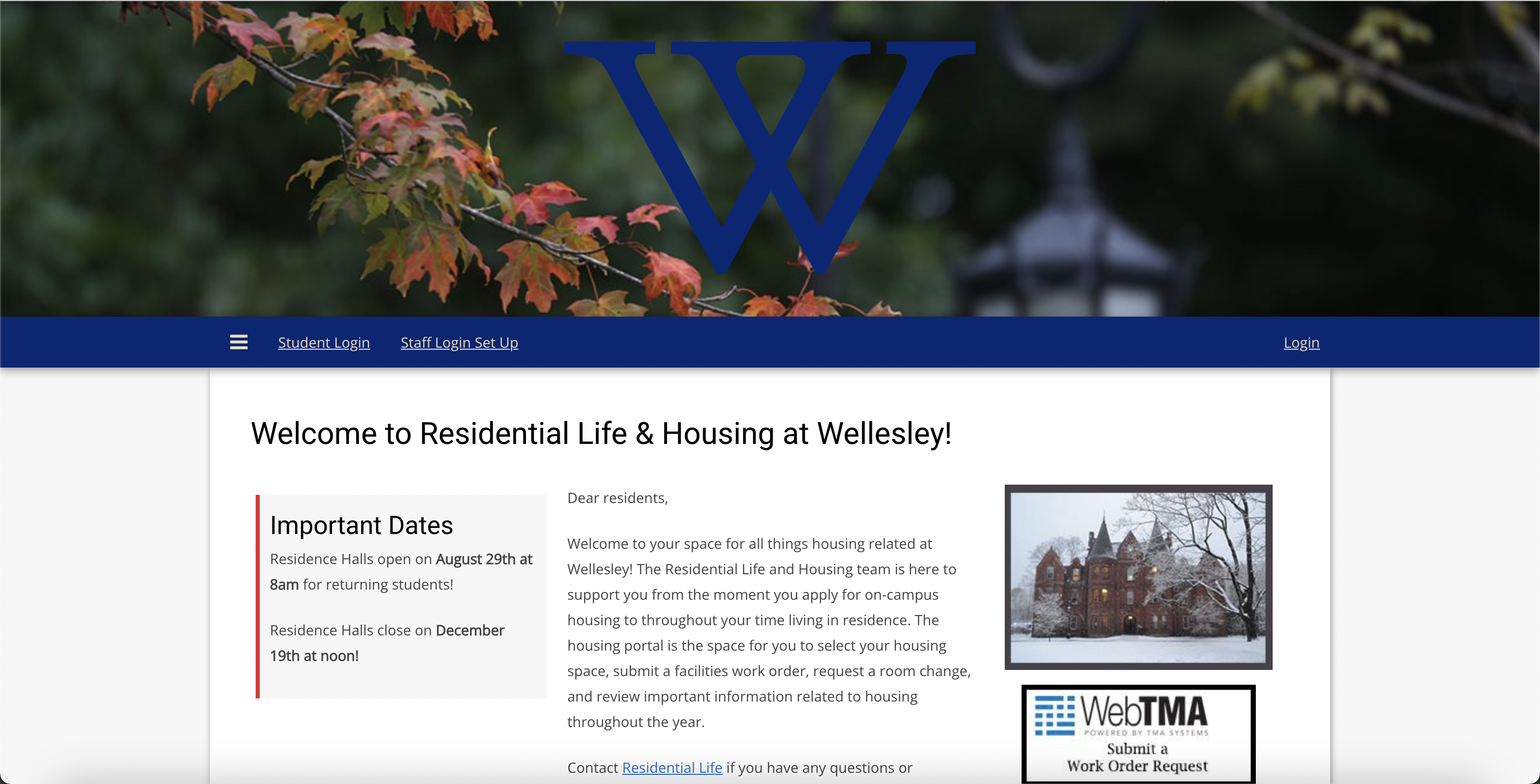
We redesigned the experience to centralize request entry, clarify categories and contacts, and expose status and next steps— while matching Wellesley’s existing web look-and-feel for a seamless, credible experience.
Goals
- Improve usability: clear entry points, concise forms, and obvious next steps.
- Increase transparency: visible status, confirmation, ownership, and timelines.
- Work anywhere: responsive, mobile-first layouts for fast submission on the go.
- Align with Wellesley: follow patterns and styling from current Wellesley sites to build trust and continuity.
Brand Alignment (Wellesley)
What we studied
We reviewed Wellesley’s existing web properties (navigation structure, spacing, color usage, and component styles) to understand established patterns and tone. The redesign borrows these conventions so the Work Order experience feels native within the broader Wellesley ecosystem.
How we applied it
- Color usage that harmonizes with current Wellesley sites while maintaining WCAG-compliant contrast.
- Type scale and spacing that mirror common page templates for familiarity and scannability.
- Nav and footer structures consistent with institutional patterns to reduce relearning.
- Button, card, and form styles adapted for clarity, readability, and quick completion.
Process & Milestones
Milestones
- Day 1: Repo setup, base HTML/CSS templates.
- Day 2: Front page, sign-in, three service categories, key contacts.
- Day 3: Add request tracking and refine visual design.
- Presentation: Troubleshoot and polish for delivery.
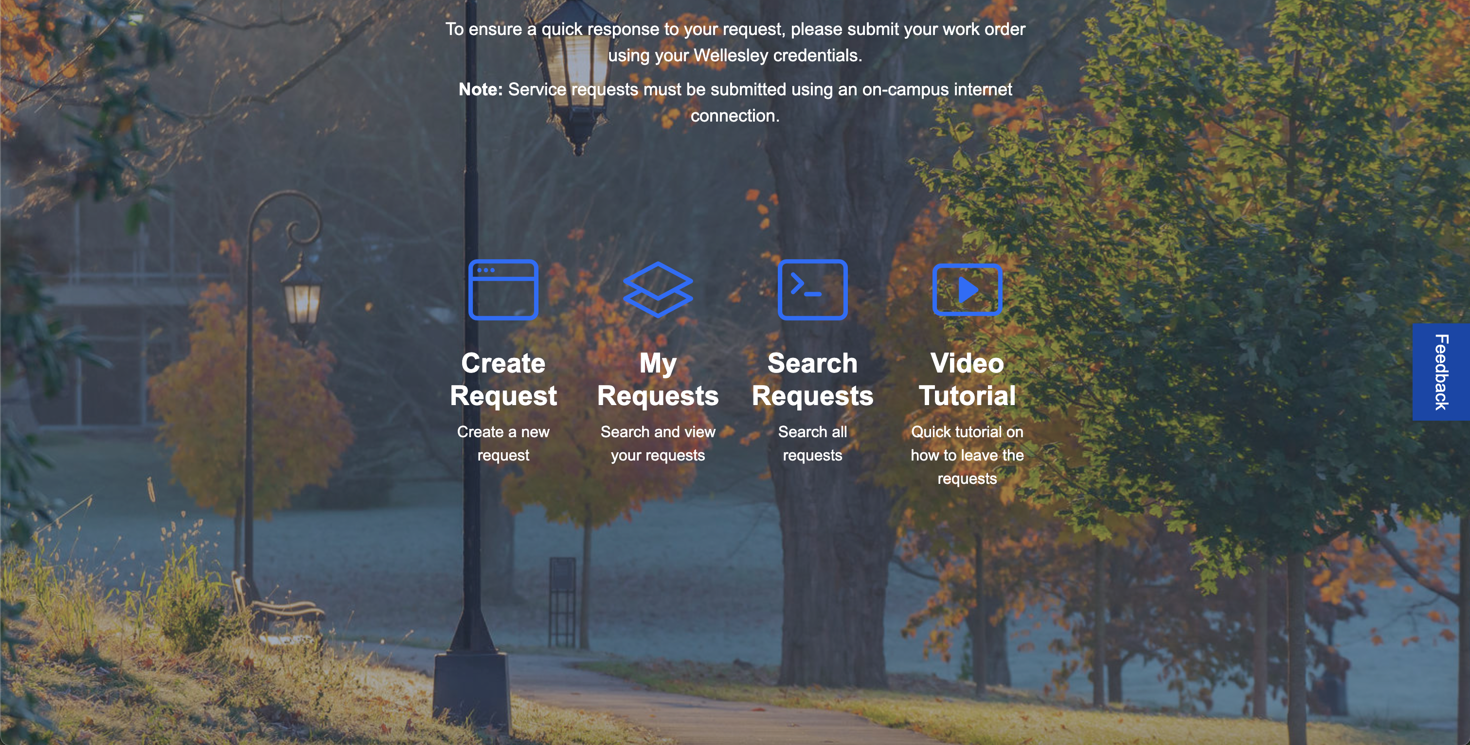
Key Features
Core
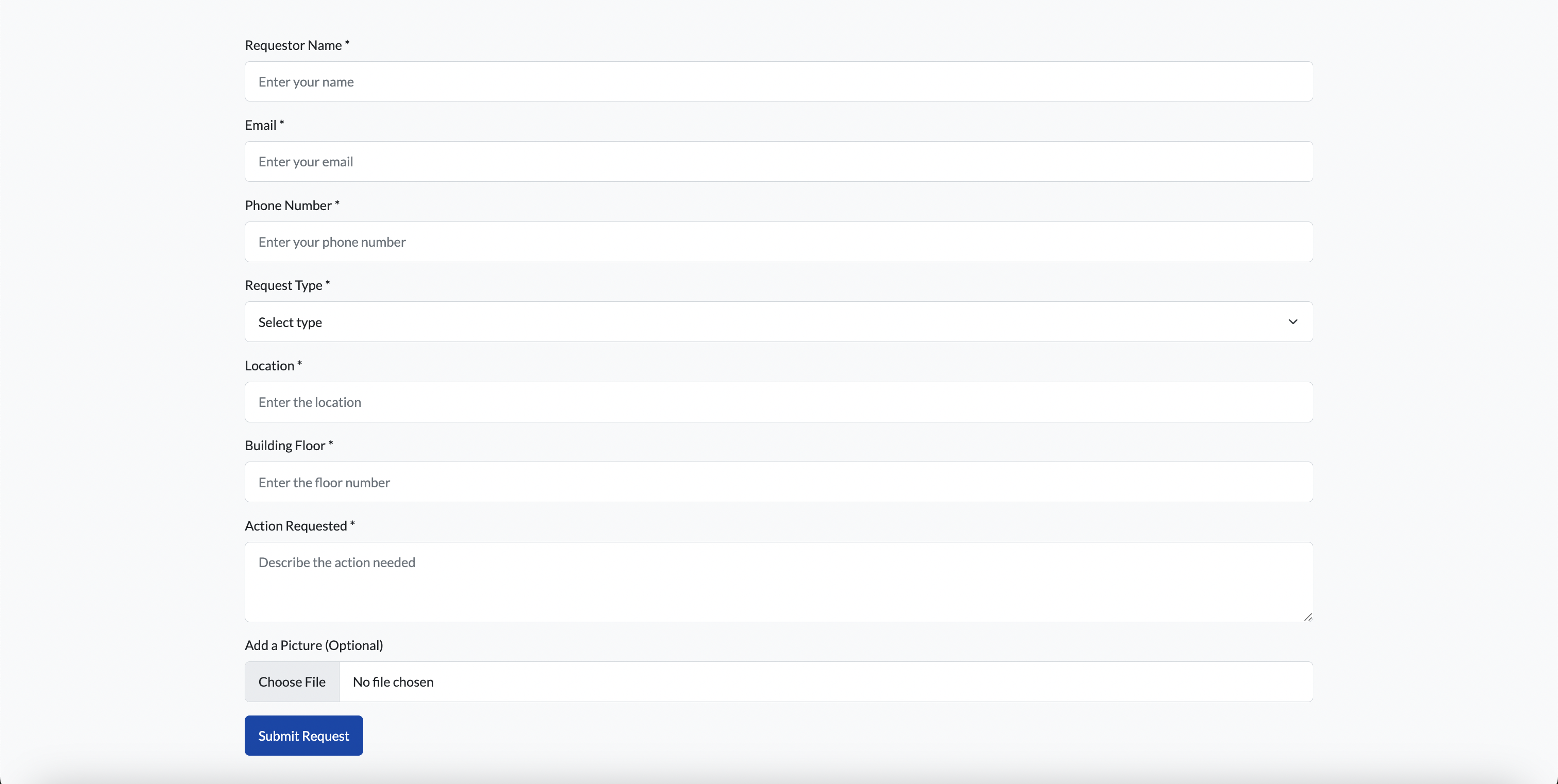
- Create Request
- See Past Requests
- See Pending Requests
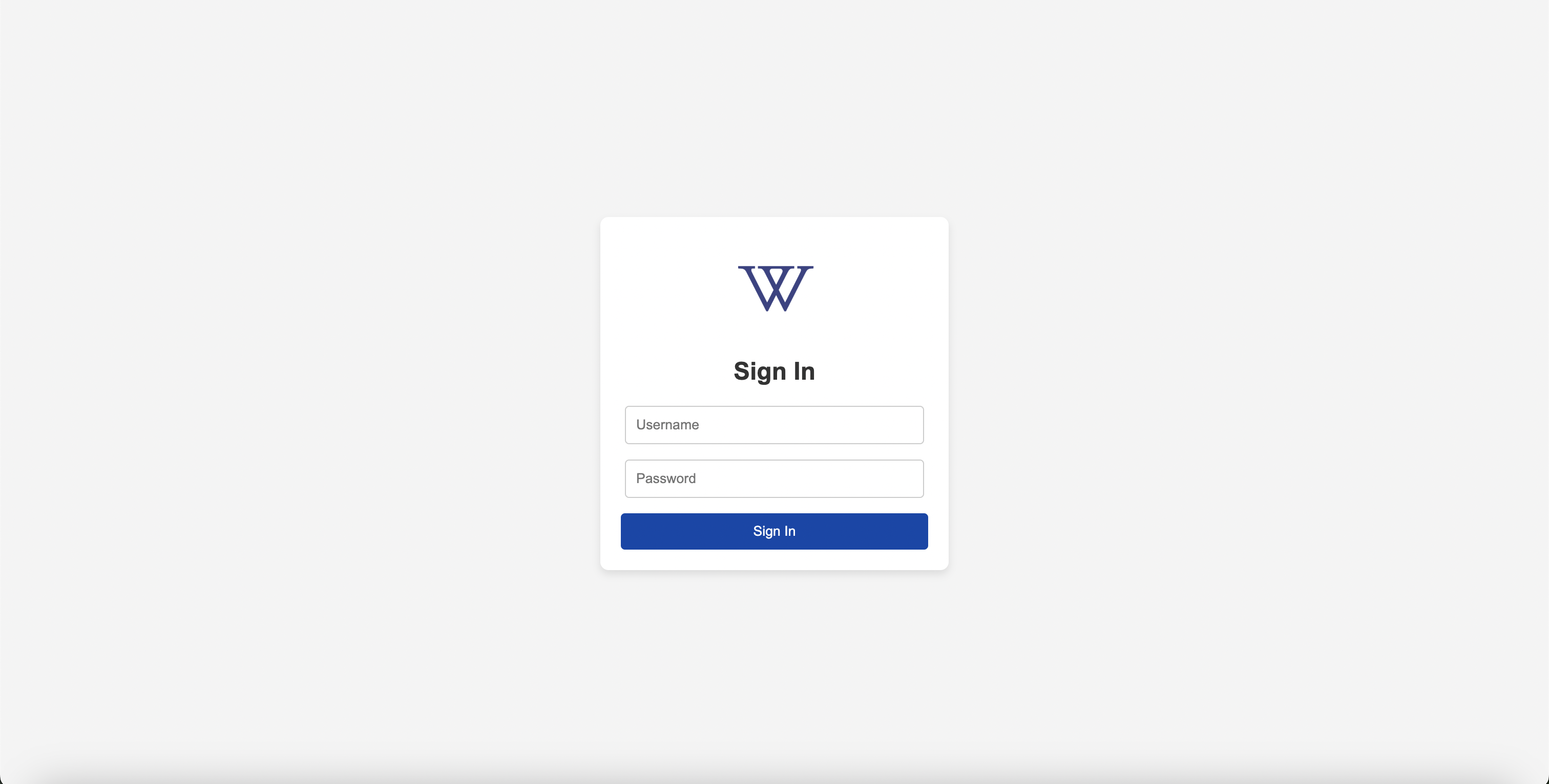
- Secure Log In
Support
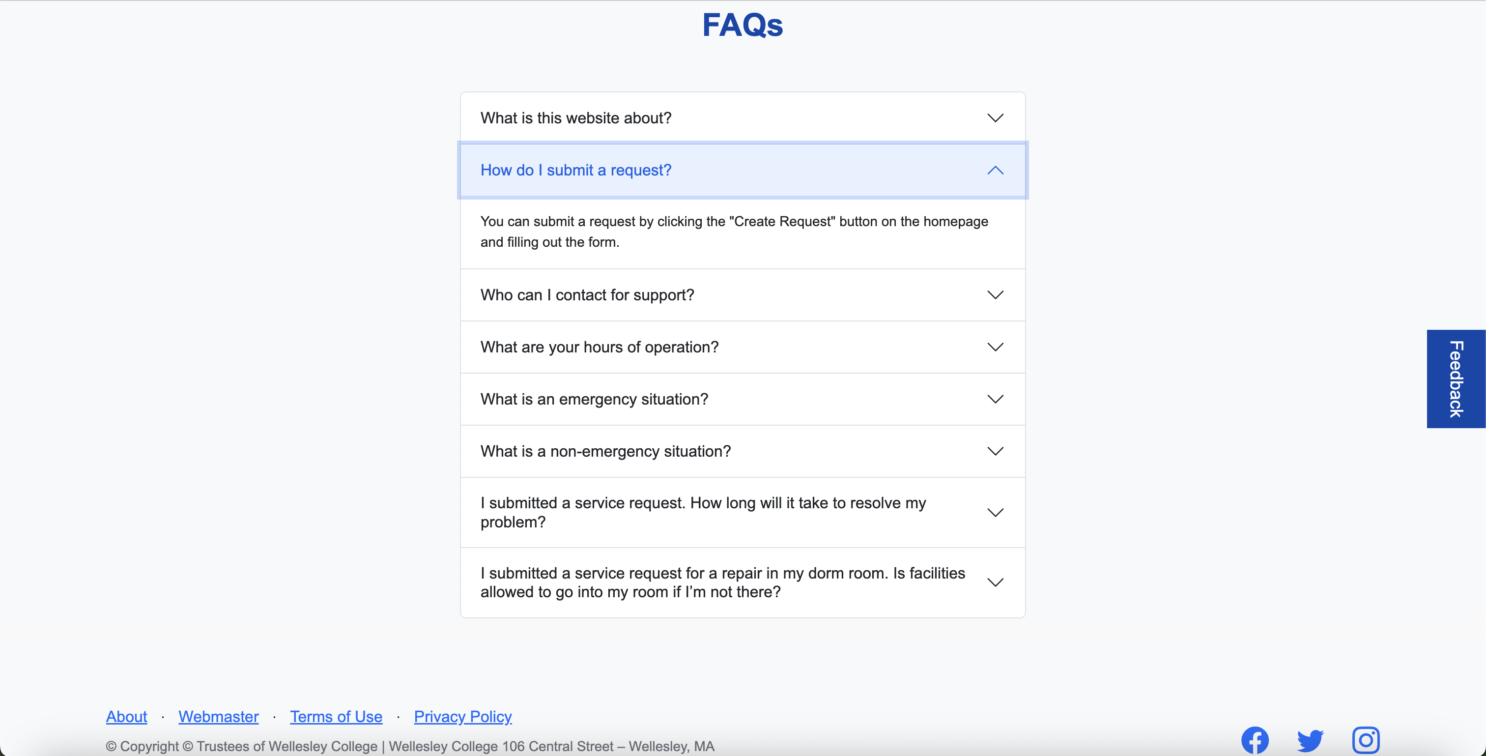
- FAQ Section
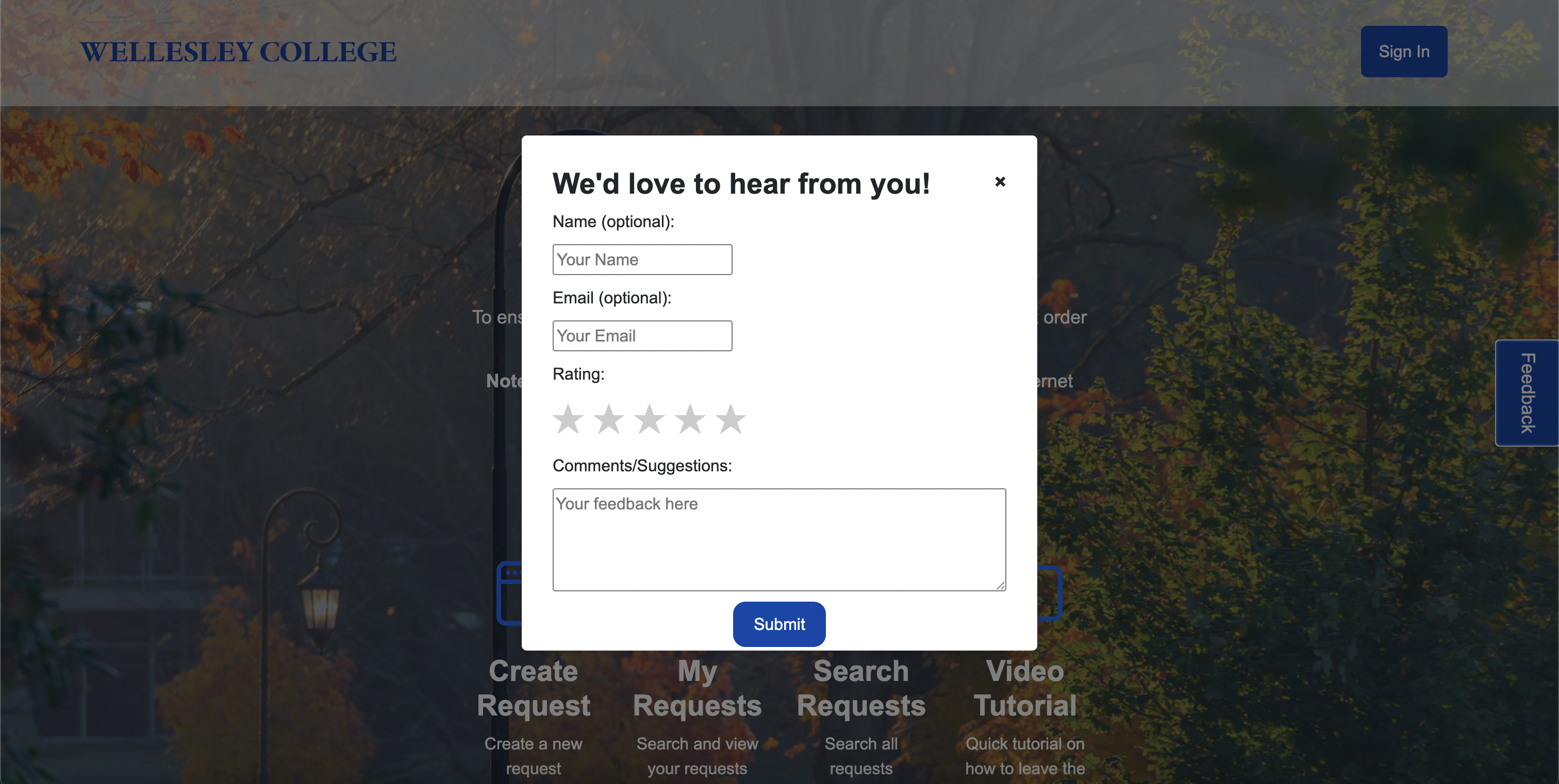
- Feedback Form
- Facility Contact Info (CDs, Maintenance, Campus Police)

Low-Fidelity Wireframe

Key Components
Create Request
Create a new request through a concise, guided form.
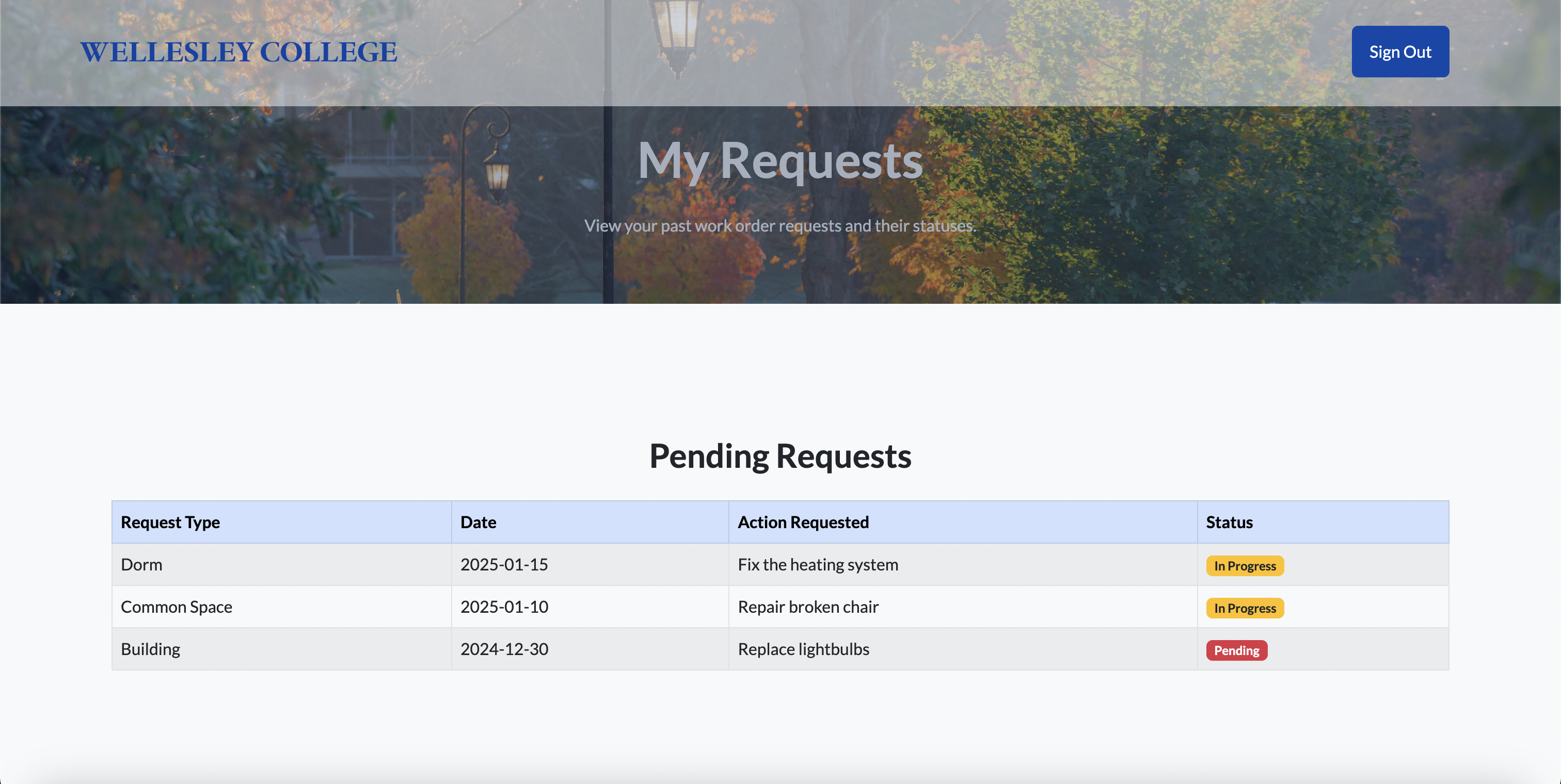
My Requests
Search and view your submitted requests with status and updates.
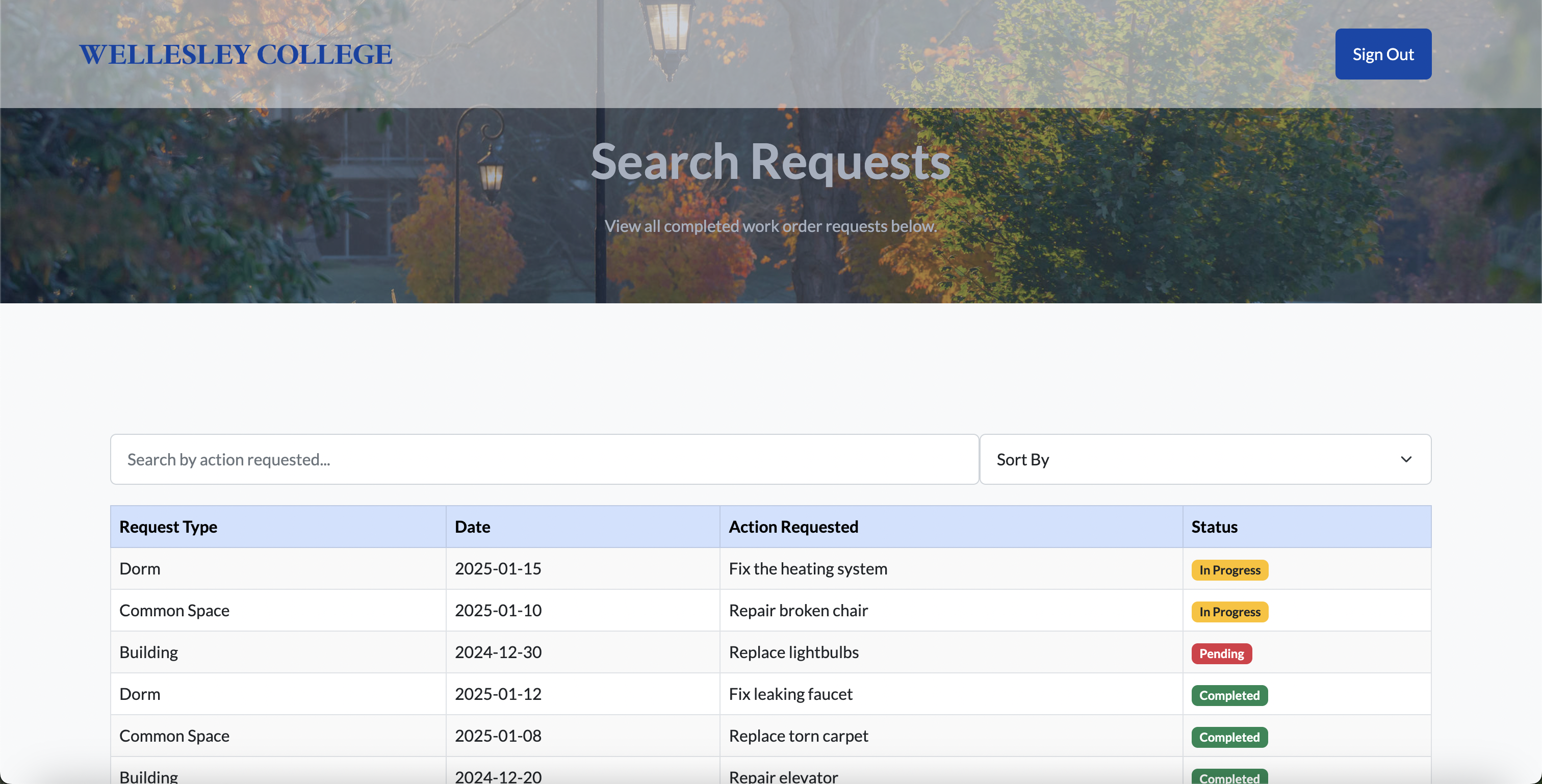
Search Requests
Search all requests (permissions-aware) for transparency and coordination.
Video Tutorial
Quick walkthrough on how to submit and track a request.
Contacts & Triage
Immediate contacts for emergency and non-emergency cases are surfaced on the landing page.
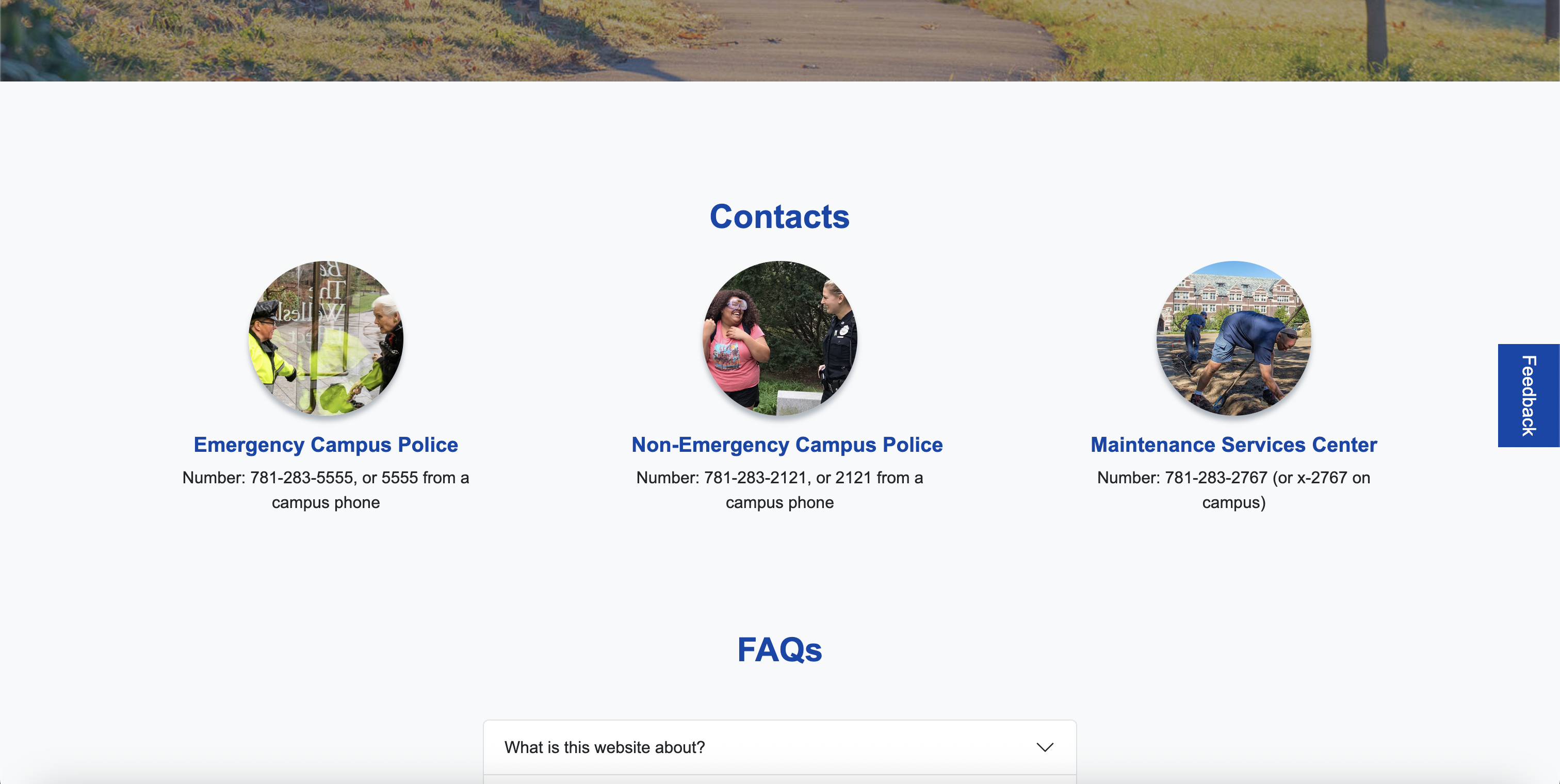
FAQ
Answers to common questions (what counts as emergency, timelines, access rules, hours, support).
Feedback & Iteration
Lightweight form for ongoing improvements and user suggestions.
Authentication & Security
Login gates sensitive data and enables secure submissions.
Before vs After
Before
Fragmented flows, unclear ownership/status, and weak mobile support increased friction.
After
Clear entry points, visible status, and responsive layouts reduce time to submit and track.

What We Learned
- Mobile reality: Students file requests on the go; responsive layouts are table stakes.
- Clarity builds trust: Confirmations, ownership, and status reduce anxiety and duplicate tickets.
- Use patterns to move fast: Reusable components accelerate delivery without hurting UX.
- Surface contacts early: Clear escalation paths minimize confusion in urgent cases.
- Brand continuity matters: Aligning with Wellesley’s current sites improves credibility and adoption.